...which isn't too bad really, is it? An uncredited design which highlights the brand and gives us a little Beyond the Fringe-era colour (unlike television itself). Five out of ten. Things get a little more exciting next year.

A bit of uncredited, proto-Vision On scattiness for 1963. I especially like the signal effect crackling across the middle of the page. It says 'white heat and activity', giving a bit of dynamism to the whole affair. Six out of ten. But then ...

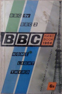
Here we are in 1964, the year in which we got Harold and his New Britain. This cover shows the BBC becoming aware of itself as a brand. "Look, here's what we can do..." and there's a lovely mast on the right beaming it all out as well. This blocky, diagonally-divided look works really well - I can imagine this being used as the test card, or materialising through the snow just as close down begins. Seven out of ten.

No comments:
Post a Comment